UX Case Study · Mobile App · 2024

IndeedRedesign

A comprehensive UX overhaul of the Indeed Job Search Android app, addressing navigation chaos, inconsistent results, and broken information architecture.

UX DesignMobile AppInformation Architecture16 Weeks
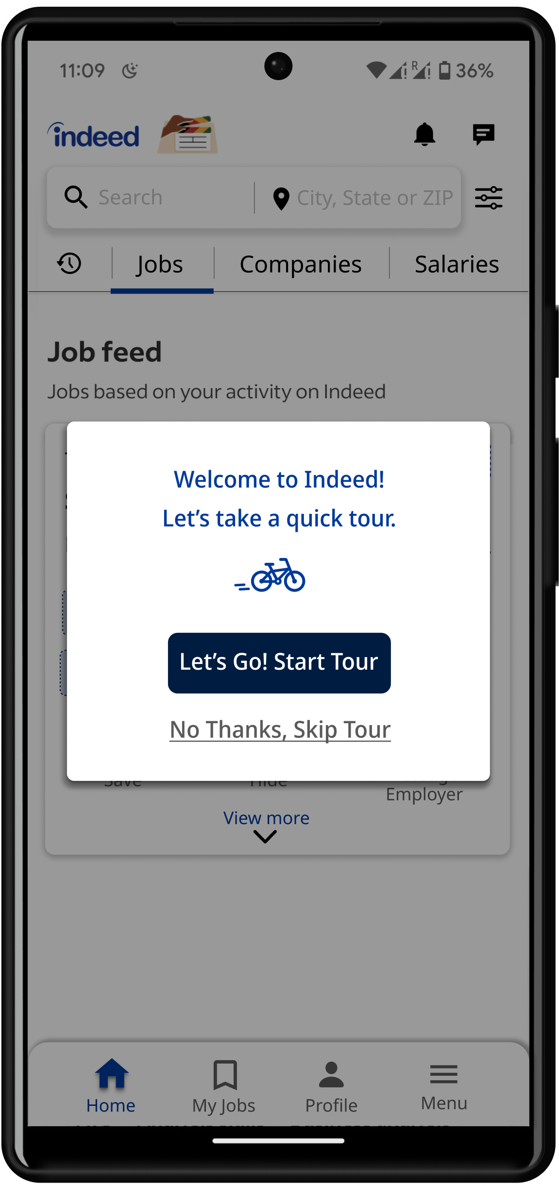
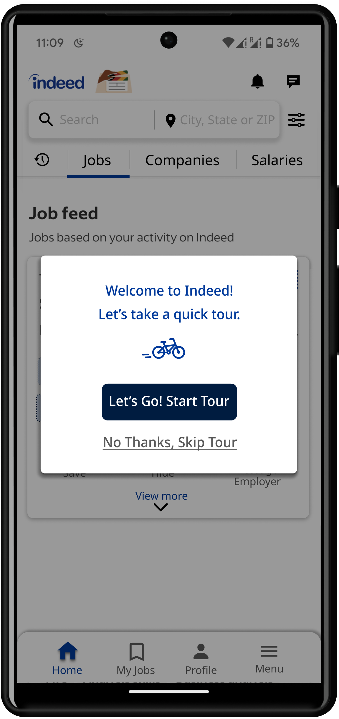
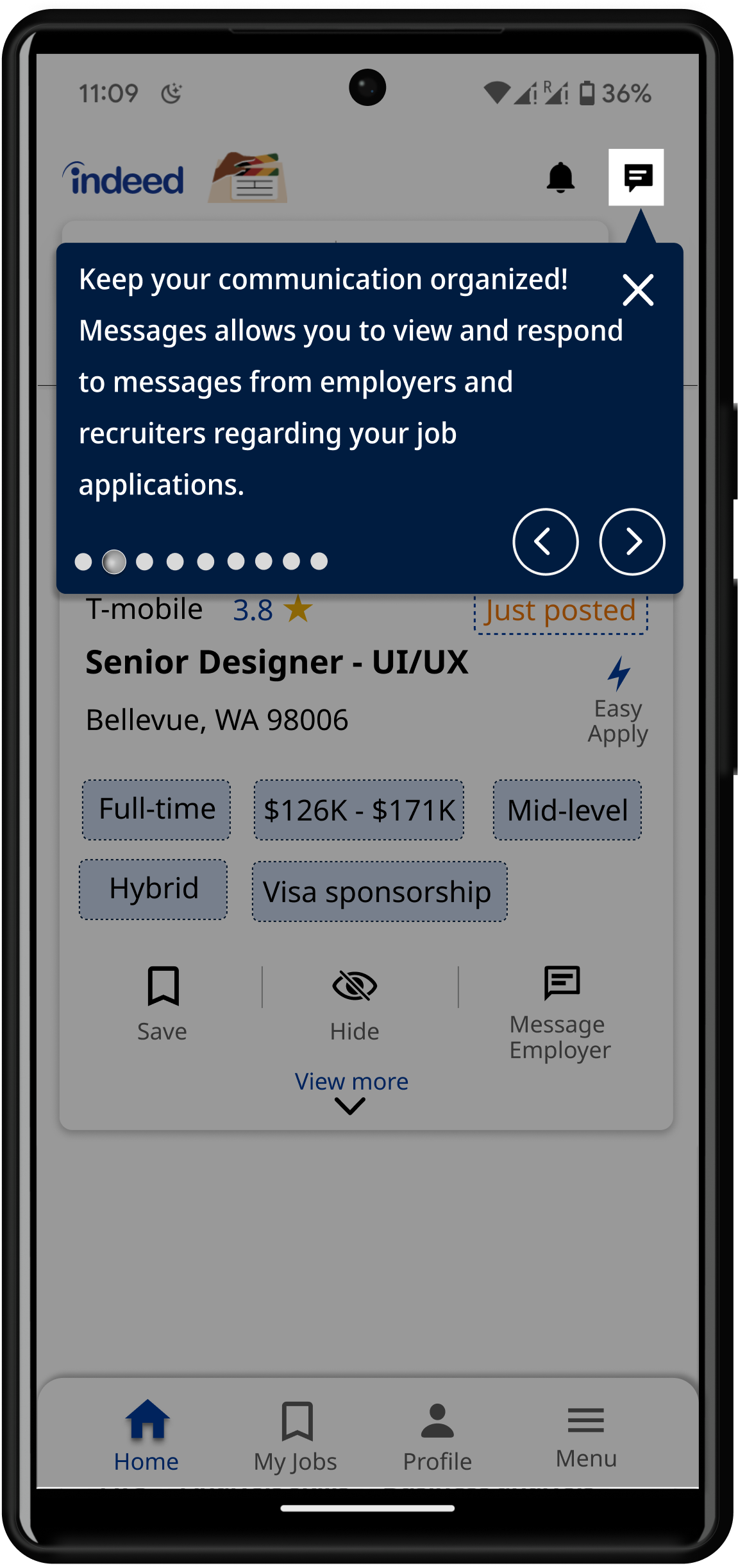
Indeed redesign prototype — start tour onboarding screen
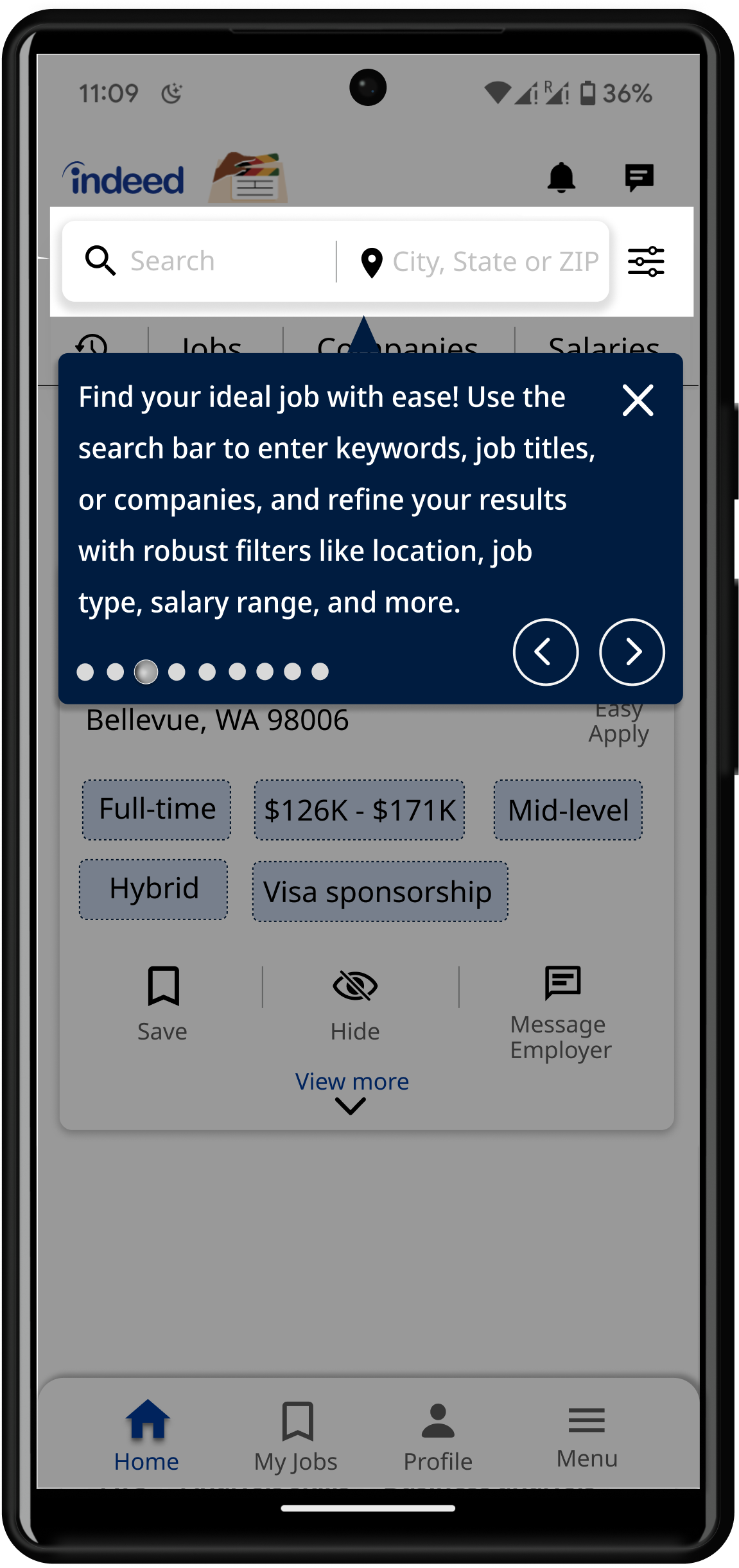
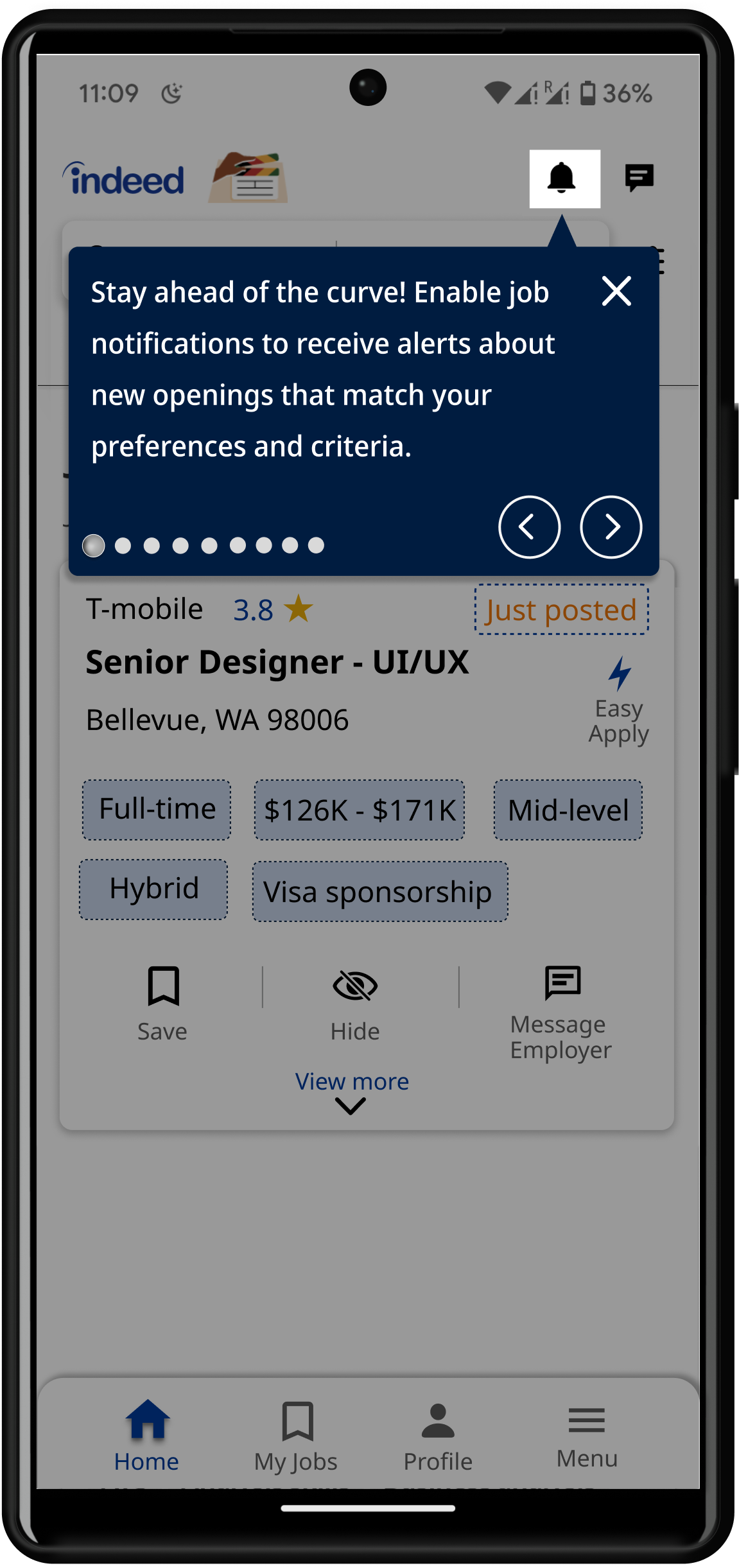
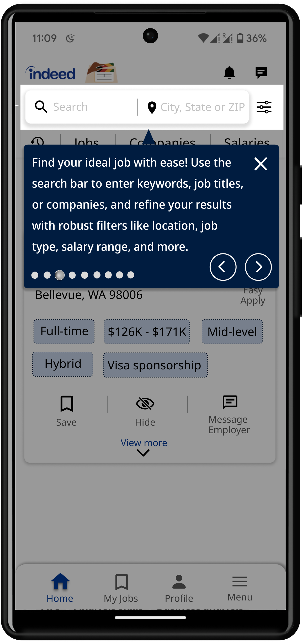
Indeed redesign — search bar and filters tour
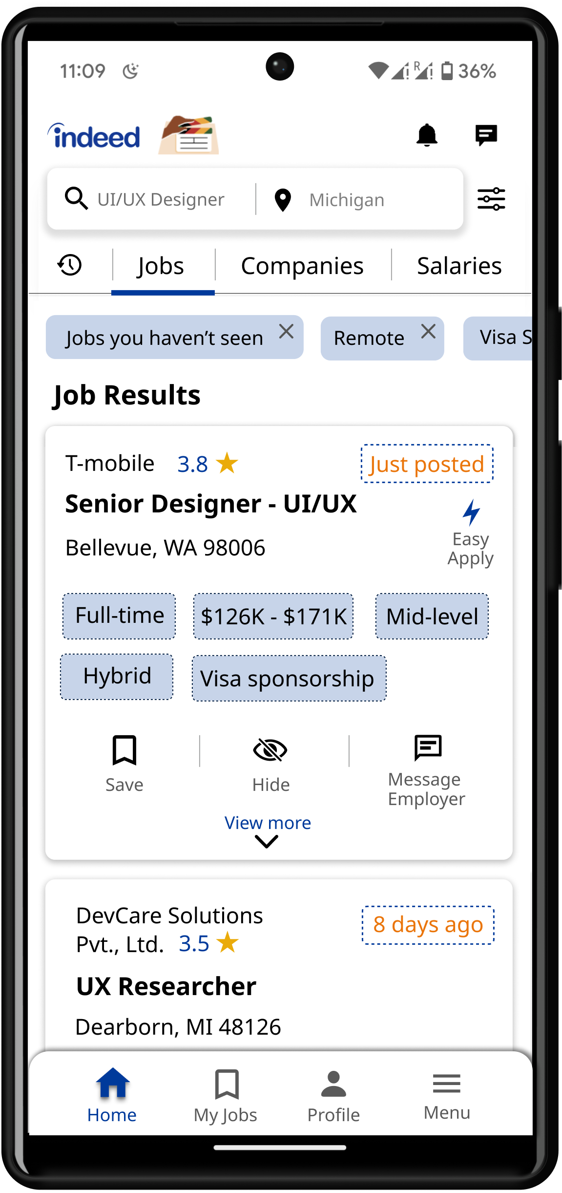
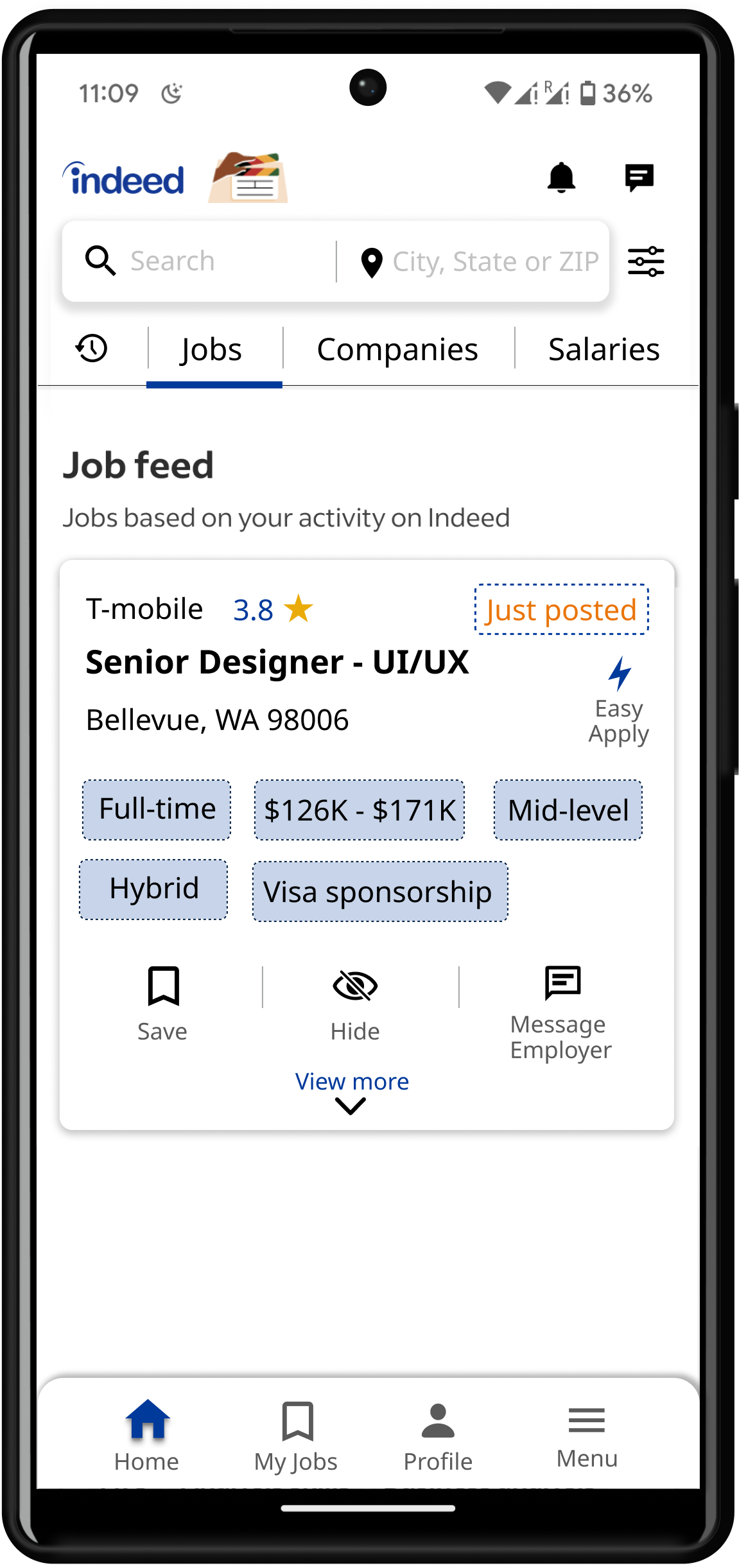
Indeed redesign — job search results screen
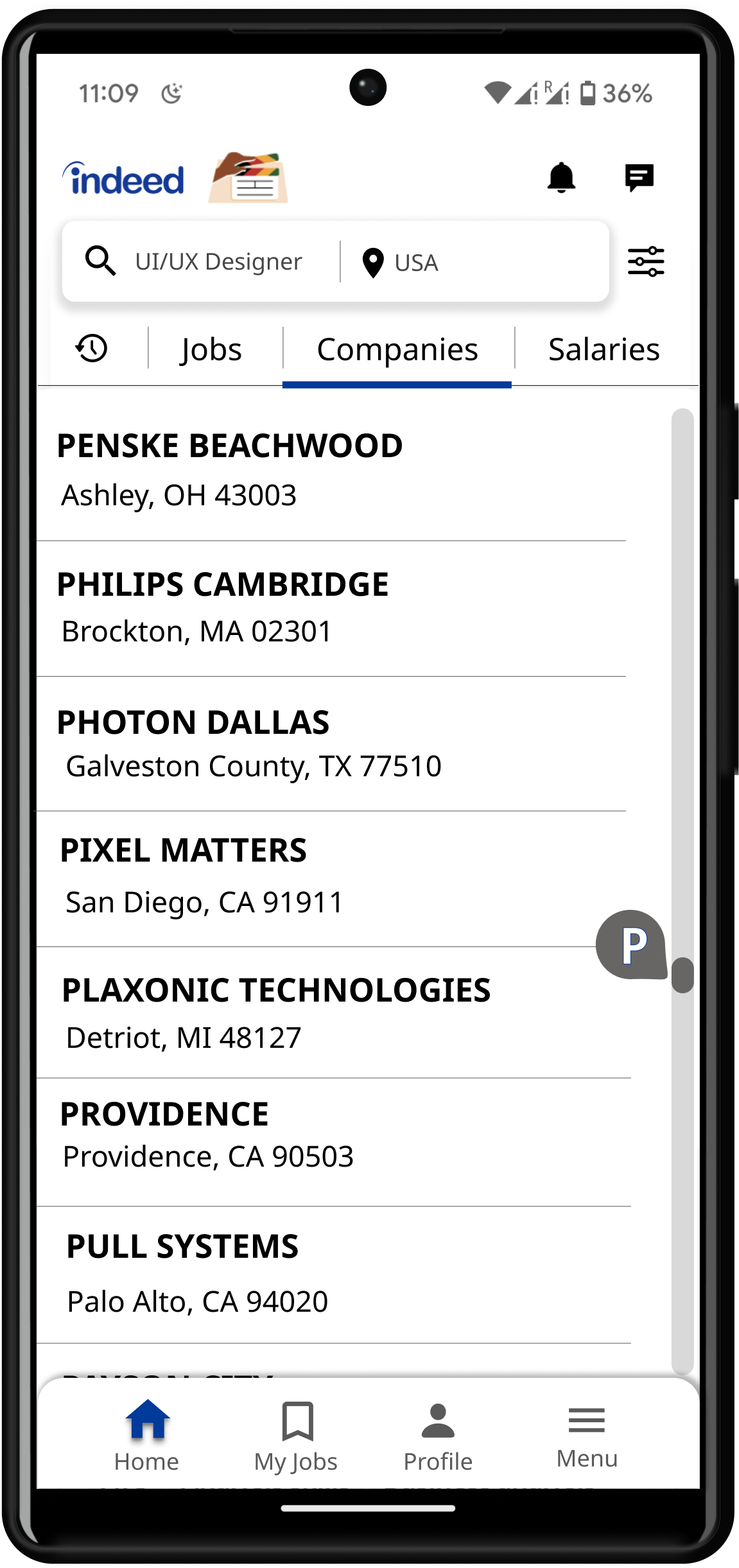
Indeed redesign — final design screen
Indeed redesign — final design alternate screen
click · hover to explore
Team
5 people
Role
UX Designer
Tools
Figma, Miro, Zoom
Timeline
Jan – Apr 2024
Scroll
The Brief

The Indeed app has usability problems and consistency issues.

The Indeed Job Search app helps users find and apply for jobs worldwide, offering job searches, resume uploads, saved listings, job alerts, company reviews, and application tracking tools.

Our team evaluated various apps, focusing on UI issues, and chose the Indeed app due to its UI performance. However, we found multiple issues, including usability problems, consistency issues, mapping difficulties, and frequent errors and slips.

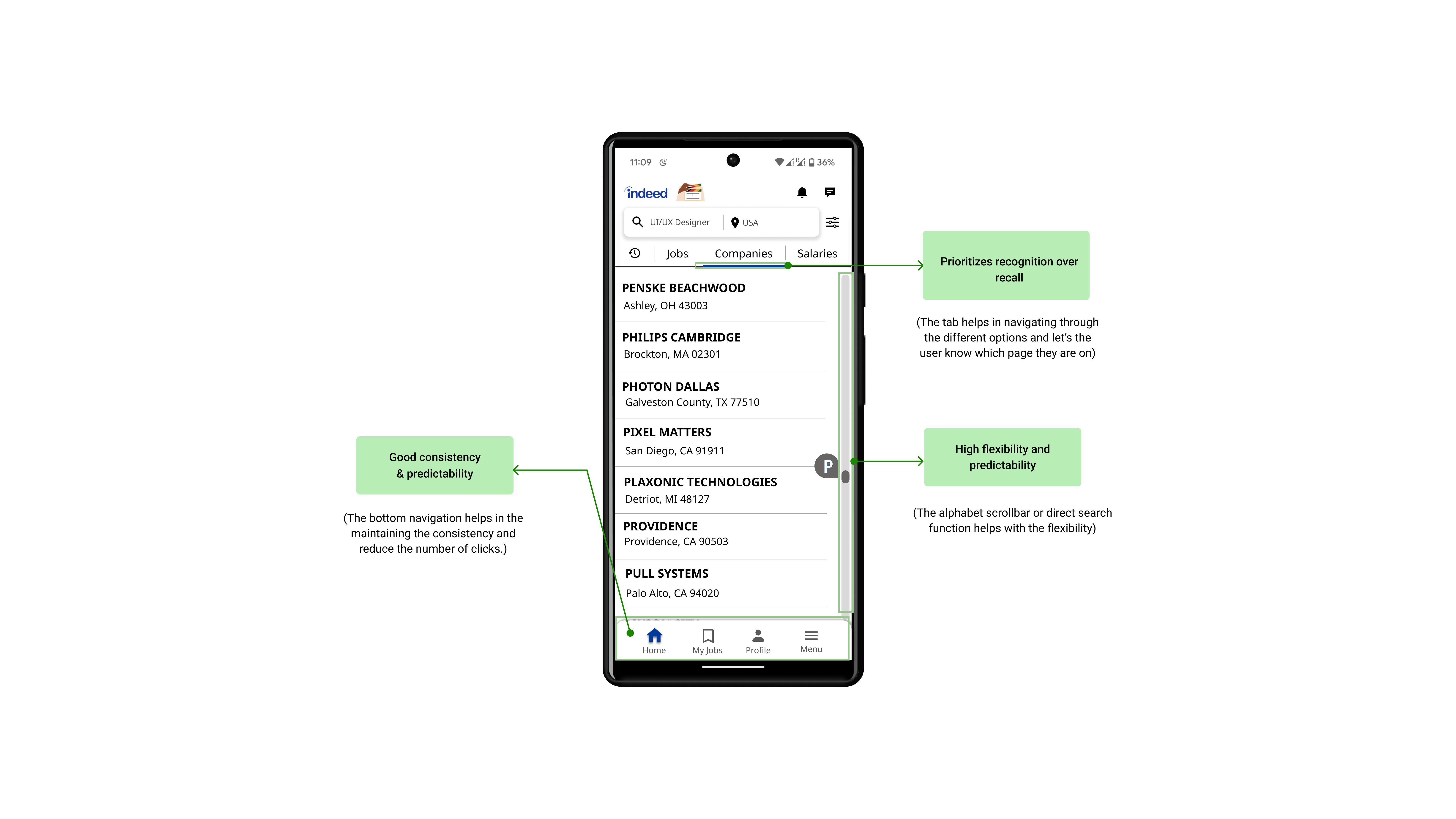
In the re-design, we optimized the UI by aligning options for easy job, company, and salary searches, added blue highlights to indicate the current page, included an alphabet scrollbar and direct search function, and introduced bottom navigation for easier access.

The Problem
HowmightweimprovetheuserinterfaceoftheIndeedJobSearchmobileapplicationtoaddressusabilityproblems,consistencyissues,mappingdifficulties,andfrequenterrorsandslips?
Design Tour

The New Indeed Experience

Android · High-fidelity app screens

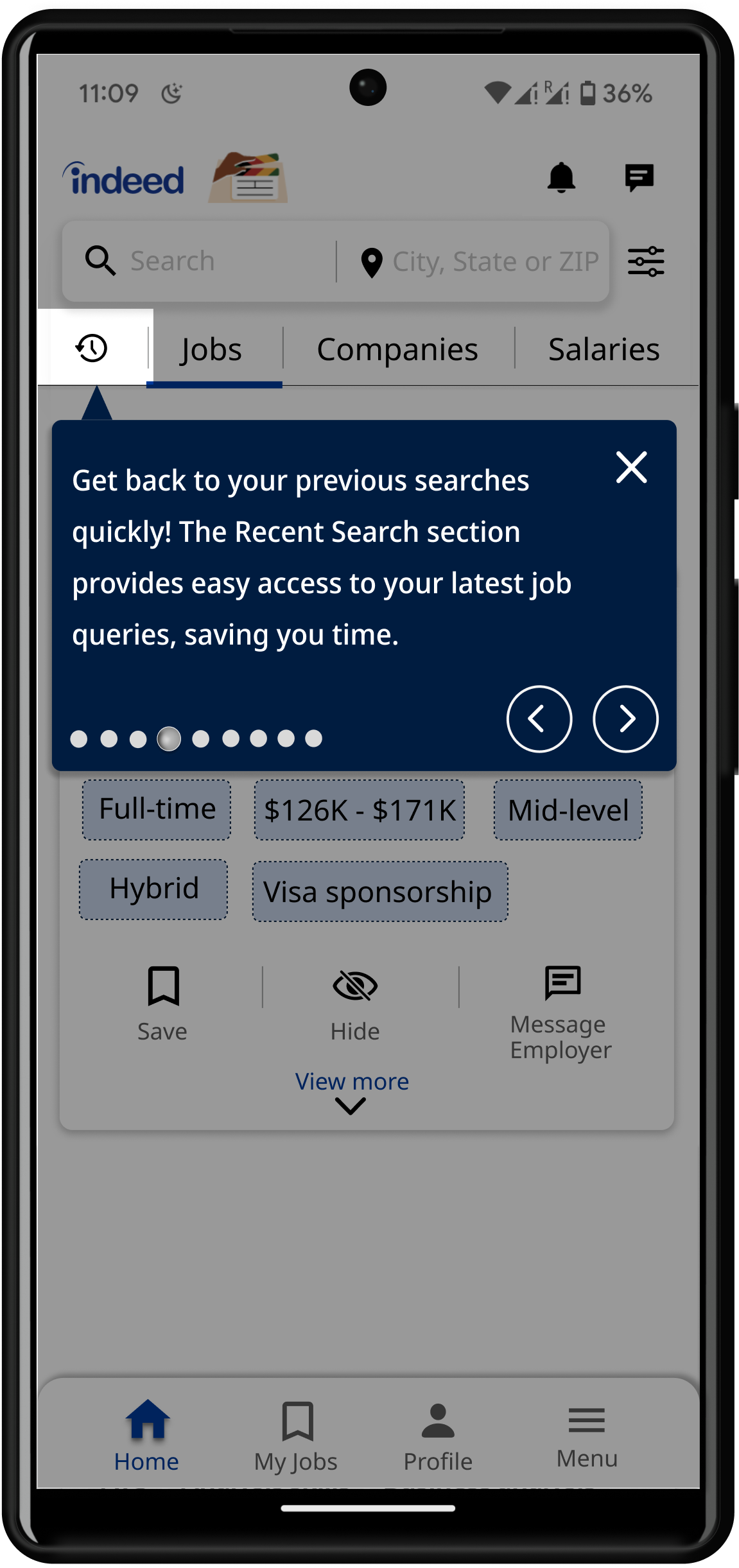
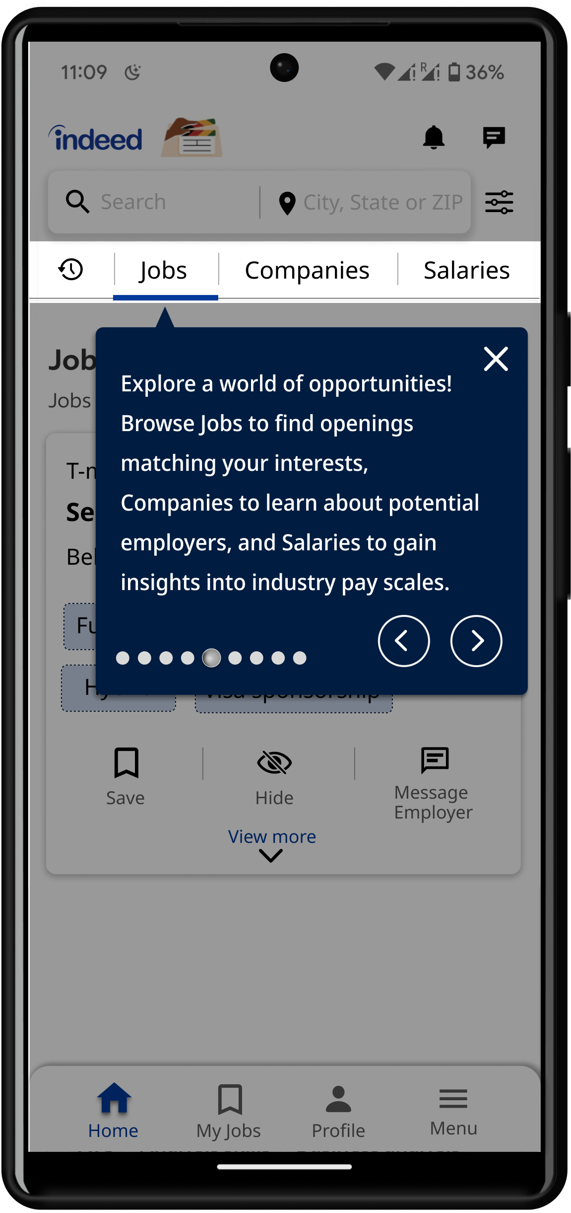
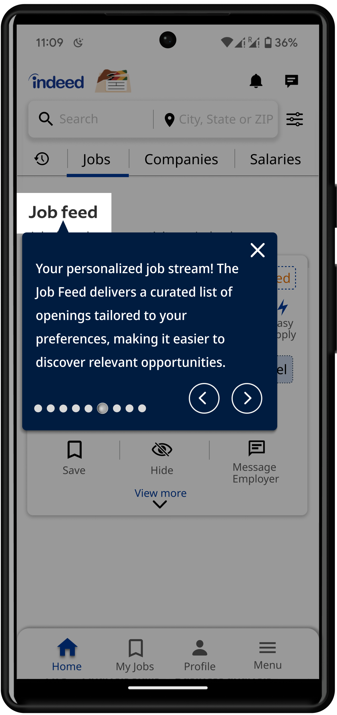
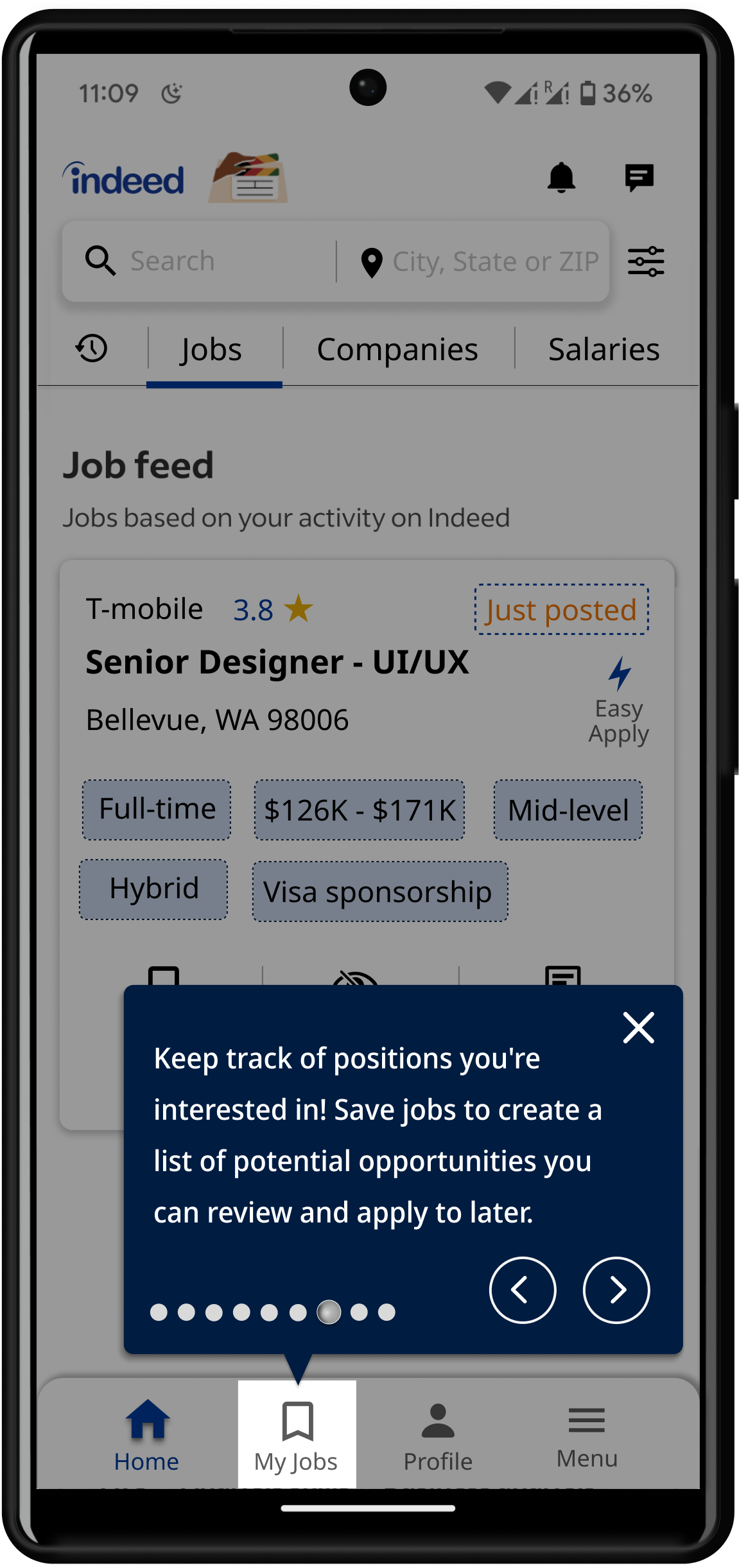
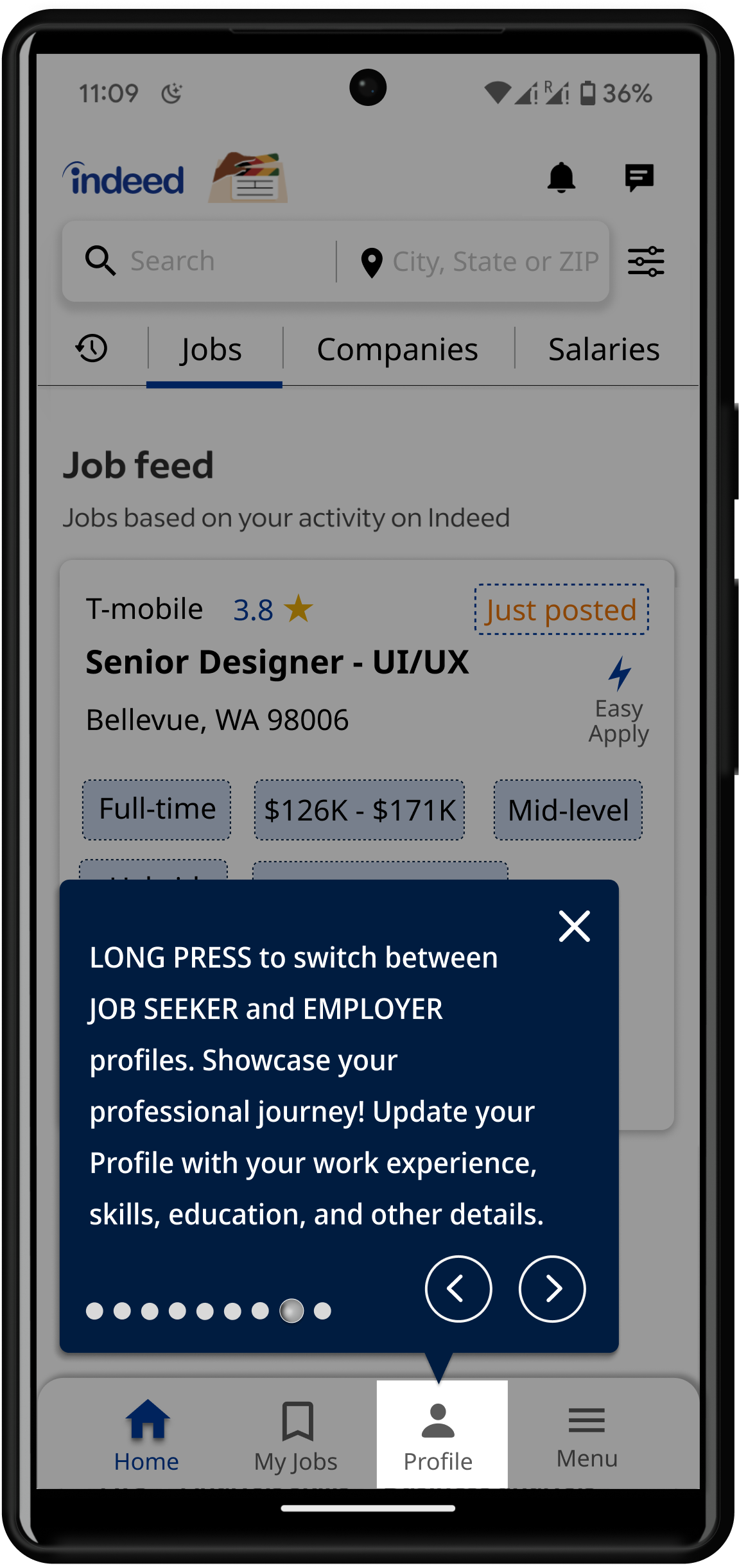
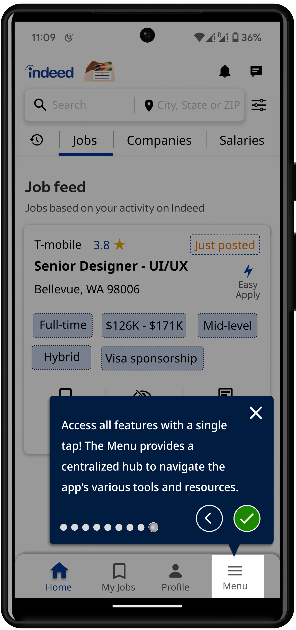
Designed and integrated an onboarding app tour in the redesigned Indeed Job Search mobile application to guide users through key features. The current app lacks a structured mobile tour, so this enhancement helps new users quickly understand functionality, reduces friction, and improves overall user experience.

Start Tour
Notifications
Messages
Search & Filters
Recent Search
Browse Jobs
Job Feed
Saved Jobs
Profile
Menu
01Start Tour
Onboarding experience
Drag · tap · pause on hover
▶ Prototype Walkthroughs

Four tasks. One redesigned experience.

Watch the redesigned Indeed app in motion across the three core user tasks — plus the onboarding tour that stitches them together.

Task 01· Browse Jobs

Finding a job should take seconds, not confusion

Problem
Hidden menus and no clear page indicators
Solution
Direct search + alphabet scrollbar + active state highlights
Direct search by jobs / companies / salariesAlphabet scrollbar for fast browsingBlue active state indicator
01 / 04
0:42
UX Research — Task Analysis

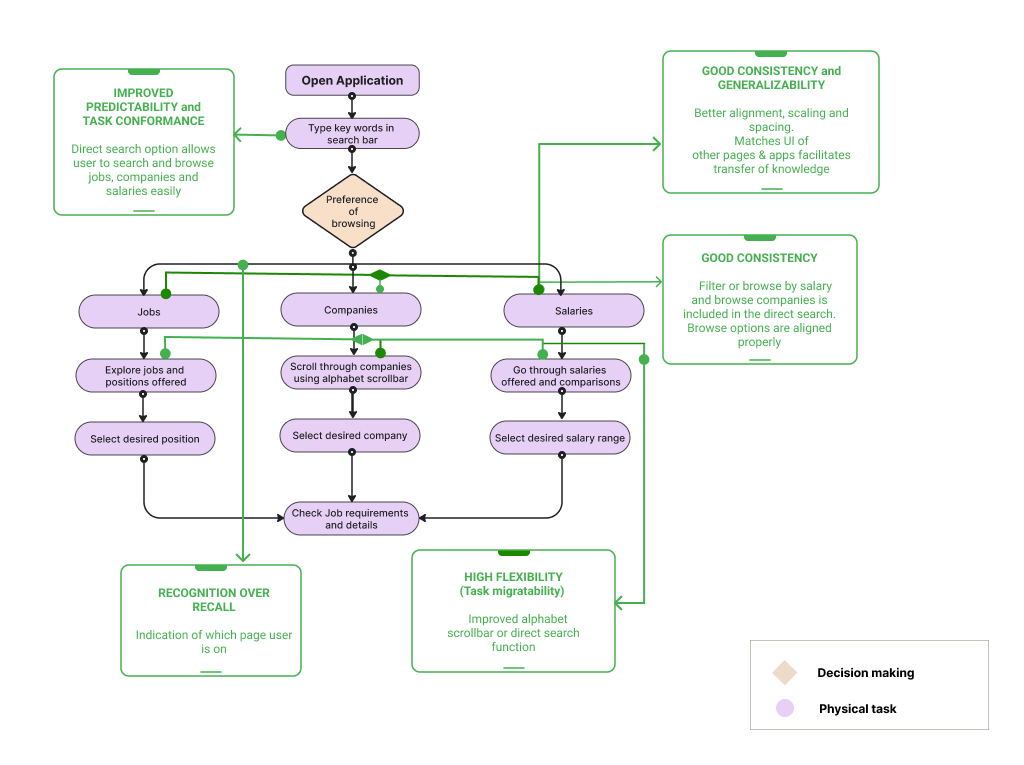
I mapped three core user flows in Miro, audited each against Nielsen's heuristics, then redesigned the flow to address every issue. Hover any problem on the left to spotlight the matching fix on the right.

11 usability issues found·11 redesign fixes mapped·3 core tasks
Issues Found
4
High severity

Low Predictability

Users cannot anticipate what 'Browse by title' will reveal — the option lacks affordance and context.

Nielsen #2 — Match with the Real World
Medium severity

Low Consistency

Browsing companies violates established patterns used elsewhere in the app, breaking learned mental models.

Nielsen #4 — Consistency & Standards
Medium severity

Low Flexibility

No path to refine, save, or reroute search. Power users cannot customize their job discovery.

Nielsen #7 — Flexibility & Efficiency
High severity

Violated Recognition

Saved/applied state forces users to recall prior actions instead of recognizing them in‑context.

Nielsen #6 — Recognition over Recall
The Redesigned Flow
9 steps
Task 01Redesigned Flow
Redesigned Browse Jobs task flow with green callouts showing each usability fix
+5 improvements
Redesigned in Figma · 9 steps · 5 improvements addressing all 4 issuesClick to enlarge
USER PERSONAS

Building Empathy

To truly understand the varied friction points within the application, I defined three distinct user archetypes navigating the job search process. Select a persona below to explore their specific needs.

Jennifer Pearson

Jennifer Pearson

32 yrs • Washington, USA
Passionate
Honest
Curious
Adventurous
OccupationData Analyst
EducationNA
"

"I want a platform that understands my skills and ambitions, delivering tailored opportunities with clear career pathways. Time is precious in this fast-paced field, and a user-friendly app can be the bridge between me and my next exciting challenge."

Jennifer is a passionate data analyst navigating the ever-evolving tech landscape. She has always had an analytical and inquisitive mindset and is fueled by the thrill of solving complex problems. Jennifer leads a focused lifestyle and does not have any detrimental habits that interfere with her work. Despite her accomplishments, Jennifer feels she has plateaued in her current role. She values a seamless job search experience that aligns with cutting-edge industry trends. She is seeking new data analytics leadership opportunities that will provide the challenges and impact she craves. Landing a Senior Data Analyst or Analytics Manager position is her next move for maximizing her analytical talents.

Scenarios

Task Scenarios

Three task-flow observations from research—expand each card to see how they informed the redesign direction.

01Task 1 — Browse Jobs
Scenario imagery: Task 1 — Browse Jobs

Jennifer · scenario

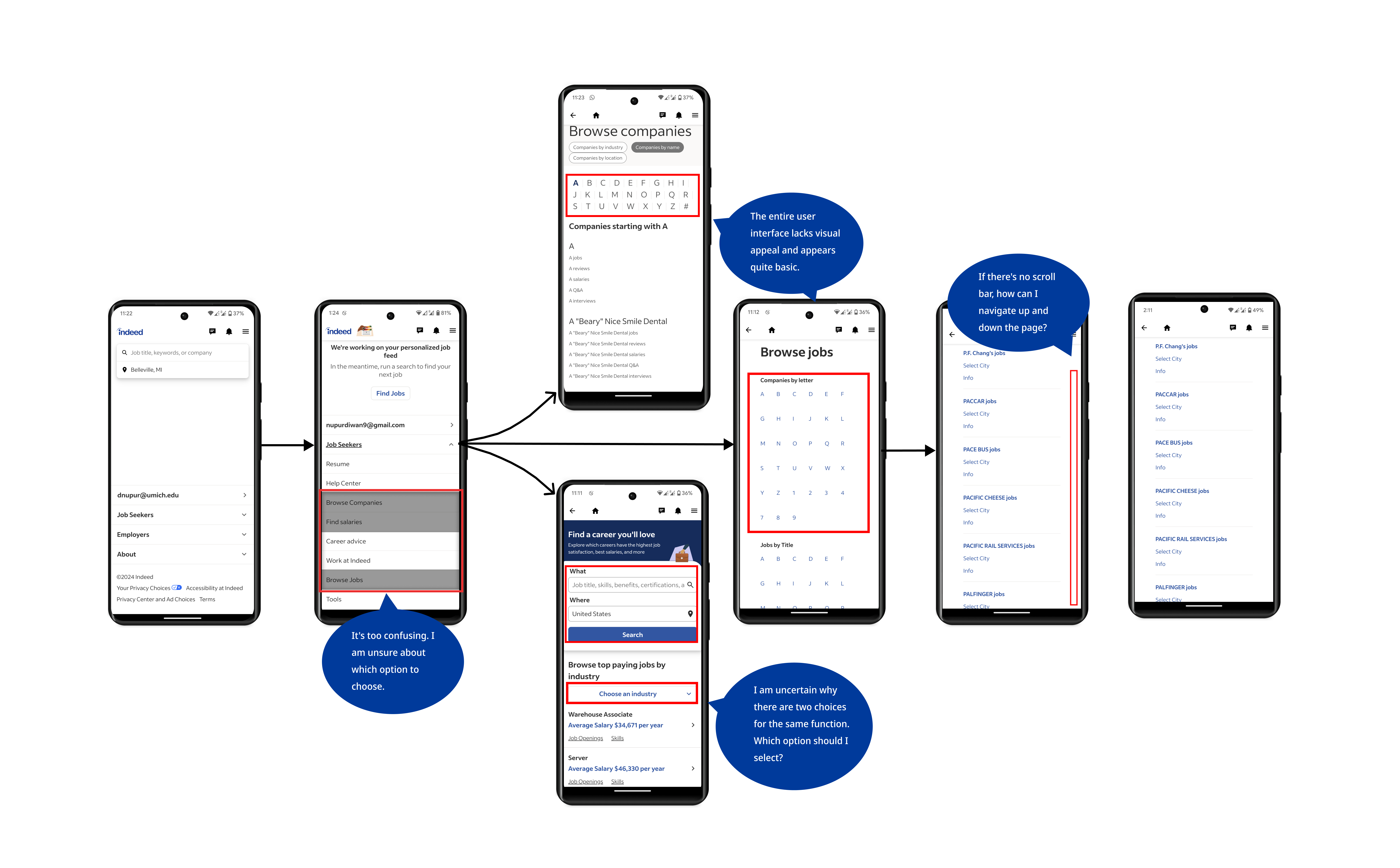
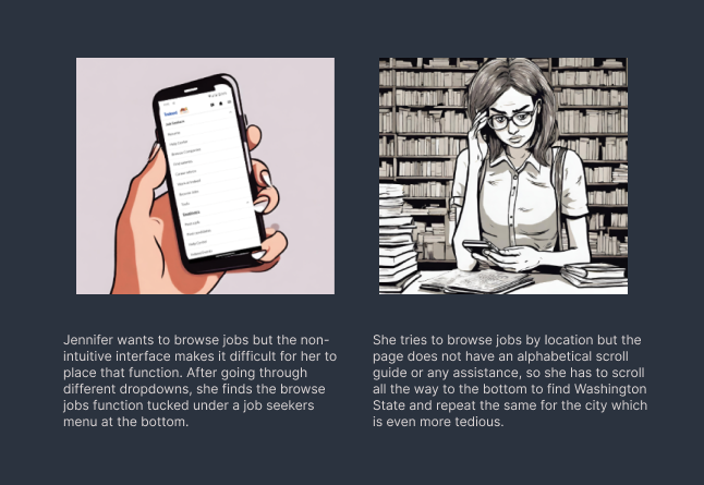
Jennifer wants to browse jobs but the non-intuitive interface makes it difficult for her to place that function. After going through different dropdowns, she finds the browse jobs function tucked under a job seekers menu at the bottom.

She tries to browse jobs by location but the page does not have an alphabetical scroll guide or any assistance, so she has to scroll all the way to the bottom to find Washington State and repeat the same for the city which is even more tedious.
02Task 2 — Navigation
Scenario imagery: Task 2 — Navigation

Alex · scenario

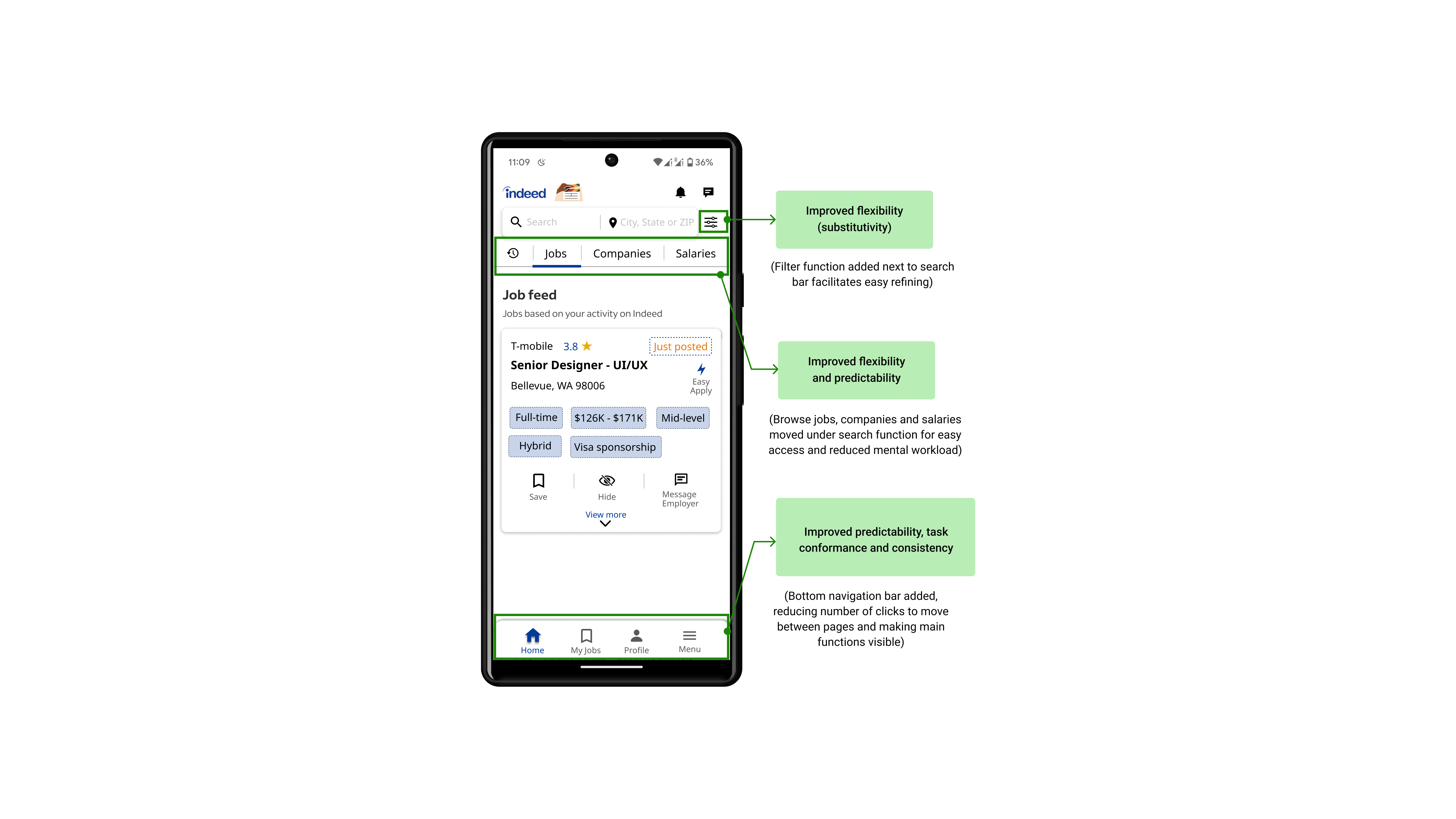
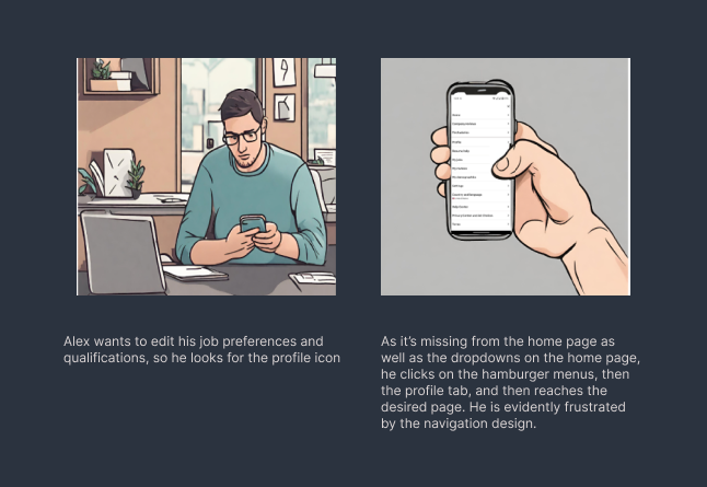
Alex wants to edit his job preferences and qualifications, so he looks for the profile icon.

As it's missing from the home page as well as the dropdowns on the home page, he clicks on the hamburger menu, then the profile tab, and then reaches the desired page. He is evidently frustrated by the navigation design.

03Task 3 — Job Results
Scenario imagery: Task 3 — Job Results

Bella · scenario

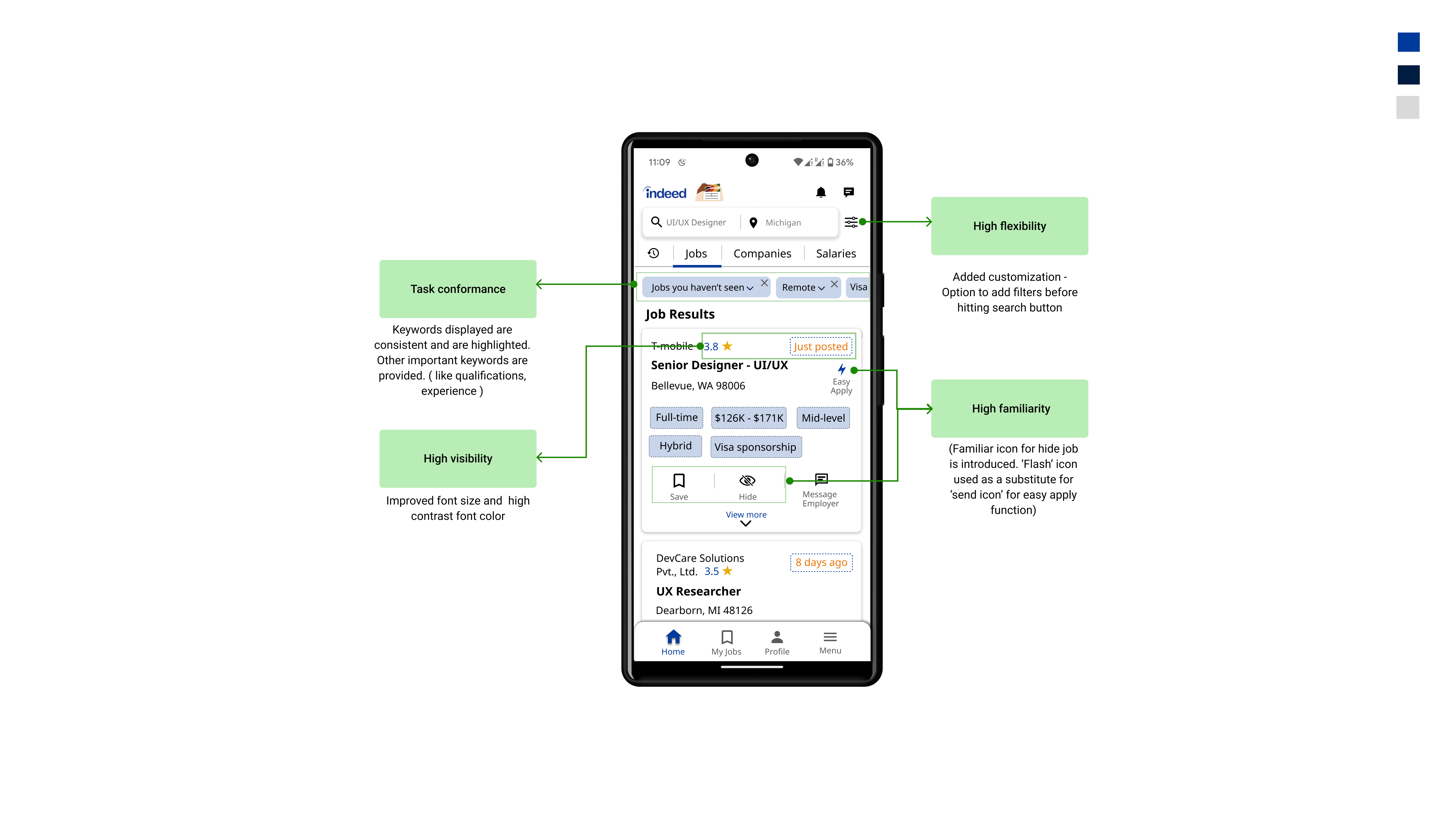
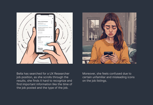
Bella has searched for a UX Researcher job position; as she scrolls through the results, she finds it hard to recognize and find important information like the time of the job posted and the type of the job.

Moreover, she feels confused due to certain unfamiliar and misleading icons on the job listings.

STORYBOARDING & COGNITIVE WALKTHROUGH

Visualizing the Journey

Mapping user stories to screen layouts reveals the micro-moments of cognitive fatigue. Switch between tasks below to explore interactive annotated walkthroughs.

JOURNEY VIEWPORT (AUTO-CENTERING)
Storyboard Viewport
COGNITIVE AUDIT INSIGHT

Primary browse functions are hidden deep in hierarchical lists instead of sitting prominently on the main landing surface.

Click the purple hotspot indicator on the storyboard to review UX design audits.

Journey Timeline

1
1. Entry Friction
Deep-Menu Discovery

Jennifer starts on the main page. She has to dig deep through cascading submenus just to find a simple 'Browse Jobs' entry point.

2
2. Choice Paralysis
Confusing Redundancies

She encounters overlapping options like 'Browse Companies' vs 'Browse Jobs' housed inside indistinct container categories.

3
3. Scroll Fatigue
Linear State List

Jennifer is forced to scroll endlessly to find 'Washington State' without the help of alphabetical jumps, indexes, or filters.

Conceptual Redesign

Three screens, mapped to heuristics.

Annotated mockups for each task — every green callout pins a decision to the heuristic it satisfies.

Task 01Browse Jobs← / → to switch · click to expand
Task 01

Browse Jobs & Companies

Active page indicator, alphabet scrollbar, and persistent bottom nav.
02
NavigationTask 02
03
Job ResultsTask 03
Task 01

Browse Jobs & Companies

Conceptual redesign — Browse Jobs / Companies screen with annotated improvements
Task 02

Navigation & Search

Conceptual redesign — Navigation and search screen with annotated improvements
Task 03

Job Results & Filters

Conceptual redesign — Job results screen with annotated improvements
Functional Comparison

Old vs New

Current State
  • Function hidden in bottom dropdown.
  • Poor alignment, scaling, and spacing.
  • Confusing layout — no alphabet scrollbar or direct search.
  • No indication of current page.
Conceptual Re-design
  • Direct search for jobs, companies, salaries.
  • Properly aligned options.
  • Blue highlight for current page.
  • Alphabet scrollbar and direct search enhance browsing.
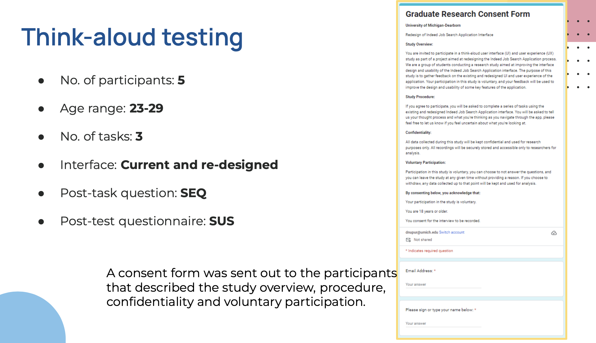
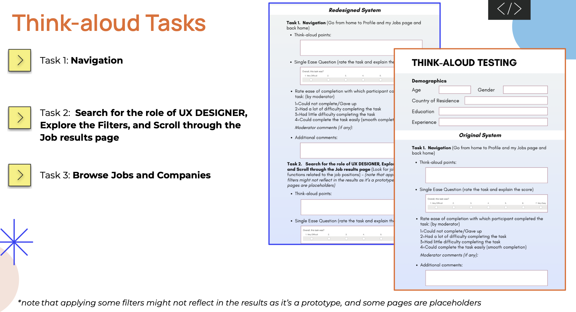
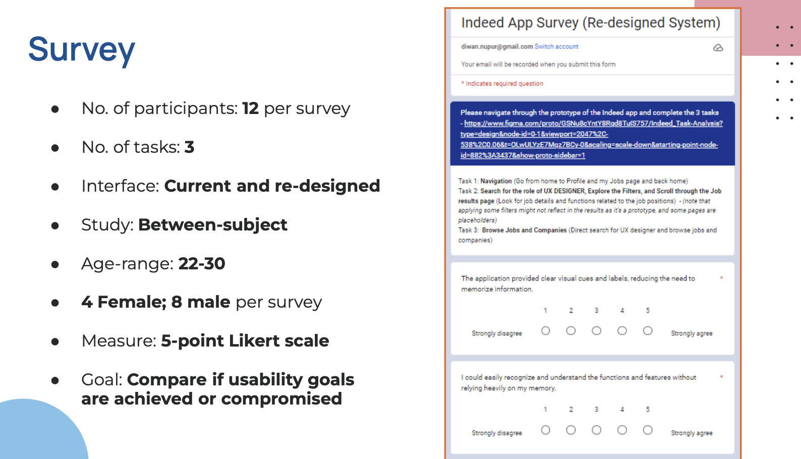
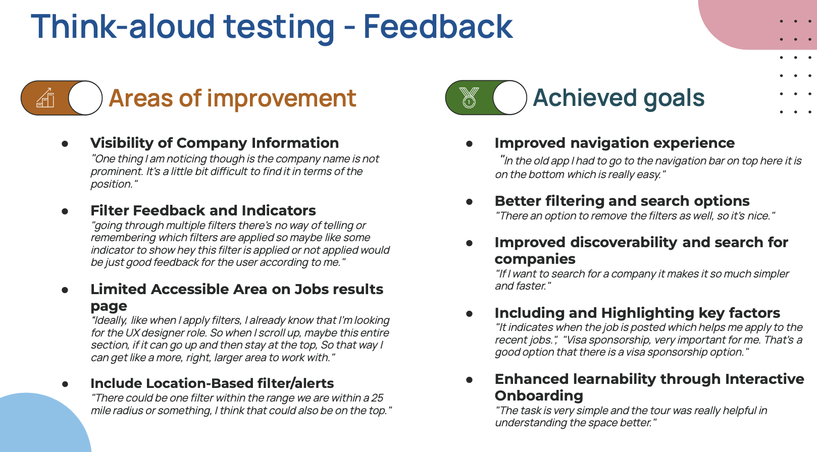
Think Aloud Testing & Data Analysis

Validating the Redesign

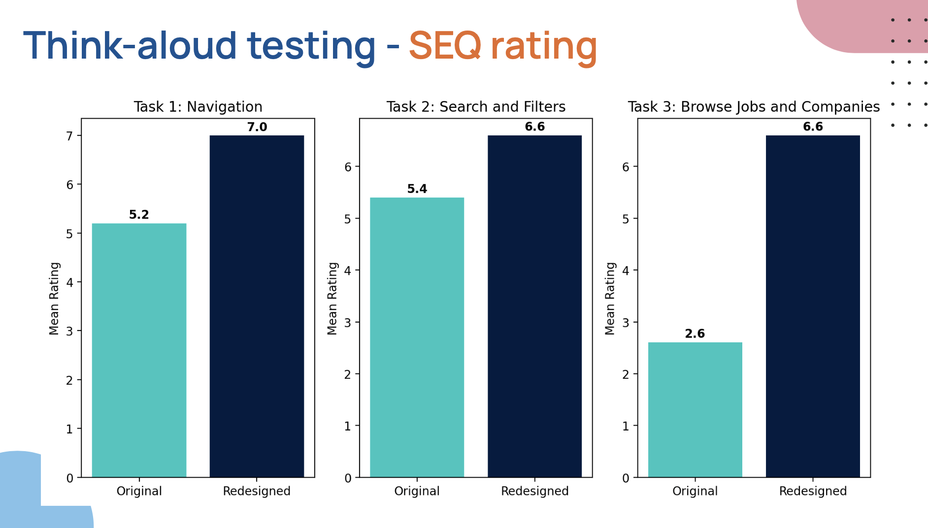
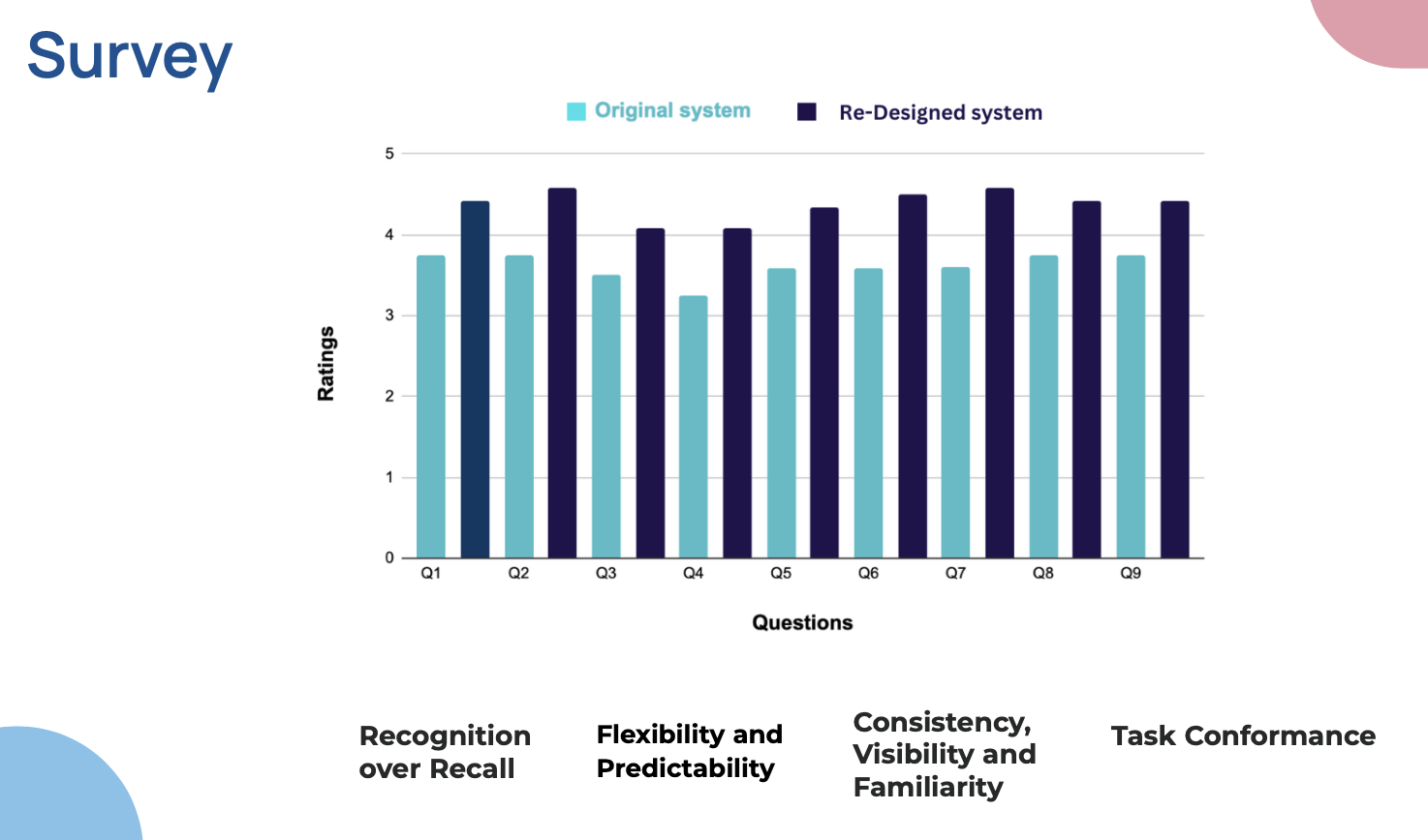
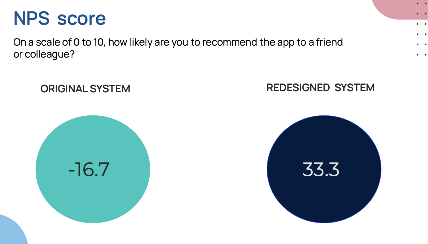
To measure the impact of the redesigned experience, I conducted rigorous think-aloud usability testing with real users. The redesign scored staggering increases across all key user-experience metrics.

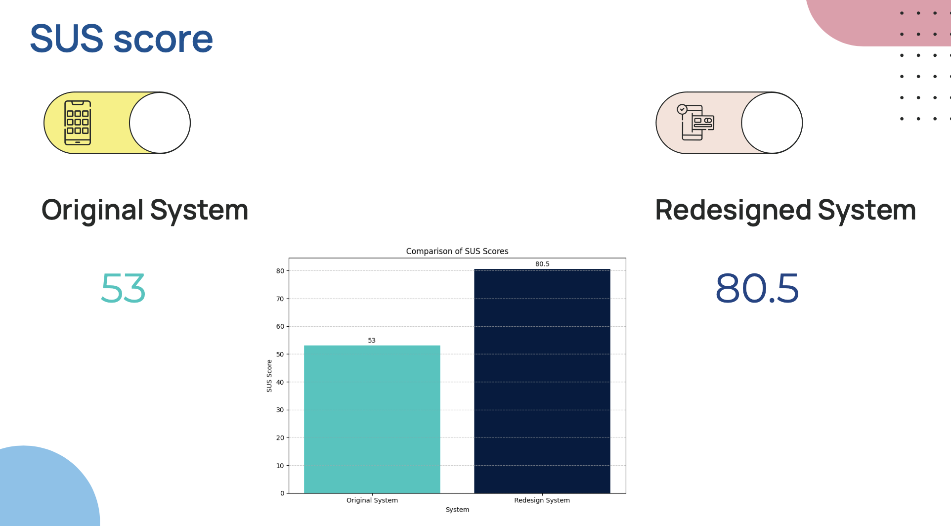
System Usability Scale (SUS)

A standardized usability framework. Scores range from 0 to 100, where >68 is average and >80 is world-class.

53.0
ORIGINAL SYSTEM
Grade F · Poor
⚠️ Low Ease of Use
+51.8% Improvement
UX SUCCESS
80.5
REDESIGNED SYSTEM
Grade A · Excellent
✅ World Class UX

Key Metric Insight: The redesign pushed Indeed's core flow from an unacceptable usability fail directly into the 'Excellent' category—ranking in the top 10% of modern web applications.

Validation Artifacts & Analysis Slides

Redesign validation slide 1
Redesign validation slide 2
Redesign validation slide 3
Redesign validation slide 4
Redesign validation slide 5
Redesign validation slide 6
Redesign validation slide 7
Redesign validation slide 8
DESIGN ENHANCEMENTS

Final Improvements

A closer look at the specific design iterations that elevated the user experience, focusing on task conformance, visibility, and recognition. Click each tab to review details and inspect the high-resolution mockups.

Reducing Search Friction

Task Conformance & UX

Clear Typographical Contrast

Visibility & Task Conformance

Active Filter Feedback

Recognition Over Recall

Established Interface Grammars

Familiarity & Consistency

Task Conformance & UX
Double Click to Expand
Heuristic #1 · Aesthetic & Minimalist Design
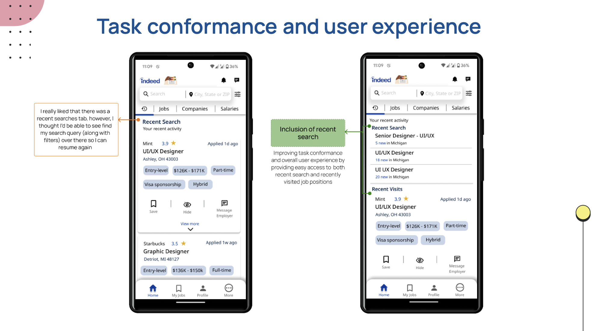
Reducing Search Friction

Placing search parameters and recent search states at the absolute forefront of the UI to optimize task efficiency and decrease cognitive overload.

Immediate search history access on tap, minimizing redundant keystrokes.
Clear, categorizable job parameters (Title, Company, Salary) grouped within clean interactive chips.
Vibrant green status markers detailing precisely what stage of the job hunt each recent query matches.

Thanks for reading.

Job search, navigation, and clarity on small screens — this case study traced research through to a grounded Android redesign. If hiring products, mobile UX, or information architecture is on your roadmap, I'd love to keep the conversation going.